
June Logo
Optical kerning, refined weight, and defined clear space, as well as well delineated placement in relation to other content all help to make it as instantly recognizable as possible at all sizes and contexts.
Construction
The June logo utilizes simple, recognizable shapes that find their inspiratoin from the physical product. It is carefully constructed to maintain ownable characteristics while still providing legibility at any size. Letters are optically kerned for visual balance.

Clearspace
To ensure the logo has good visibility and isn't obstructed by surrounding elements, a clearspace equal to the height of the x-height of the logotype must be maintained. The descender and dot of the "j" can be disregarded.
Clearspace exceptions
Logo Color
In order to ensure good visual contrast, the June logo should appear black on white backgrounds and white on darker backgrounds.


Scale
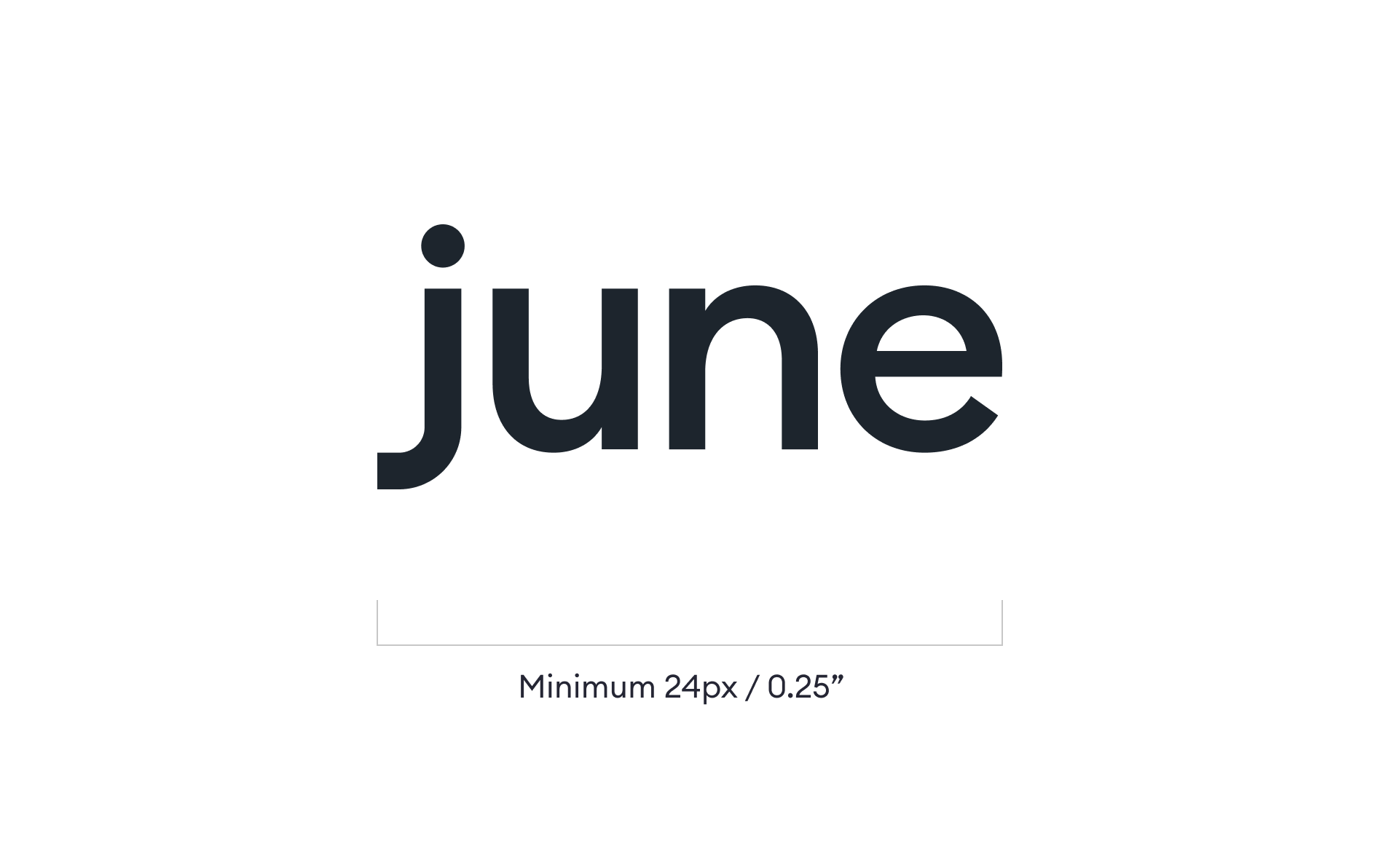
The June logo was designed to be used at very small sizes, for both print and digital. The smallest size the June logo may be used is 24px / 0.25” in width.
Social Icon Construction
The x-height of the June logo should be centered vertically and horizontally in the icon shape, whether square or circular. Use the “n” in the logo as a guide for padding on the left and right.
Guidance


Color
June's colors are inspired by the kitchen, and the tech June is born from. Primary colors of White and Cast Iron provide a clean and sophisticated foundation, complimented by warm and inviting hues of the kitchen (and June's cooking!).
Primary Colors
White
CMYK — 00 00 00 00
HEX — FFFFFF
PMS — White
Cast Iron
CMYK — 90 68 41 90
HEX — 1D252D
PMS — 433 C/U
Warm Glow
165deg
#FF5A3C 0%
#C8102E 100%
Orange Spice
CMYK — 00 80 80 00
HEX — FF5A3C
PMS — 172 C/U
Tomato
CMYK — 03 100 70 12
HEX — C8102E
PMS — 186 C/U
Color Usage Proportions
Guidance

Typography
June's typography is friendly and approachable, and as easy to use as June! It functions well in both print and digital applications at both large and small scales. The typefaces were chosen to maximize June's impact while keeping it easy to read, ownable, and recognizable.
Euclid Circular B
Euclid Circular B draws its inspiration from June's precision engineering, specifically its round air flow vents. Euclid is a Swiss-inspired geometric typeface where the circle is the foundation of its construction. Letters such as 'a', 'b' or 'p' that have stems and bowels have immaculate round corners and punctuation is based on circular dots.

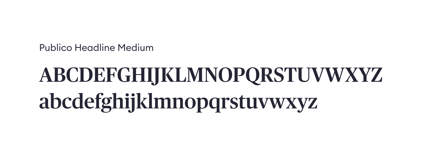
Publico Headline Medium
Publico inherits many characteristics from classic typefaces such as Didot (read: Joy of Cooking) and Guardian. But, Publico takes many cues from contemporary type design with narrow proportions, consistent character widths, square, sturdy skeleton, and a pleasant openness. The balanced interplay between sharp serifs and soft ball terminals and lack of fussy details gives the face a clean, contemporary look and a quiet elegance.
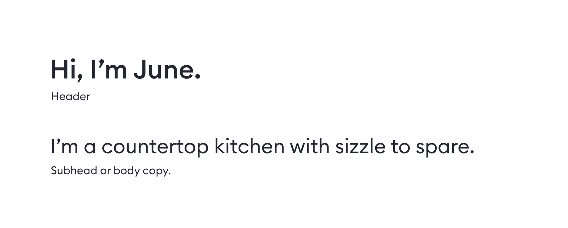
Hierarchy
It is important to maintain visual hierarchy by use of scale and weight. Headers or headlines should always command more visual weight than corresponding body copy. At a minimum, headlines should be at least the same point size as the body copy and set in Euclid Medium. If the headline is scaled larger, either weight can be used so long as proper visual weight is achieved.
Guidance
June's primary typeface is Euclid Circular B, Regular. For large bodies of copy such as sales copy, descriptions, blog posts, etc, Euclid Regular should be used.
Euclid Medium should be used for subheads or smaller areas of copy where a bolder face is needed for hierarchy or visual weight.
Publico may be used for larger headlines, such as page headings where legibility is not a concern.


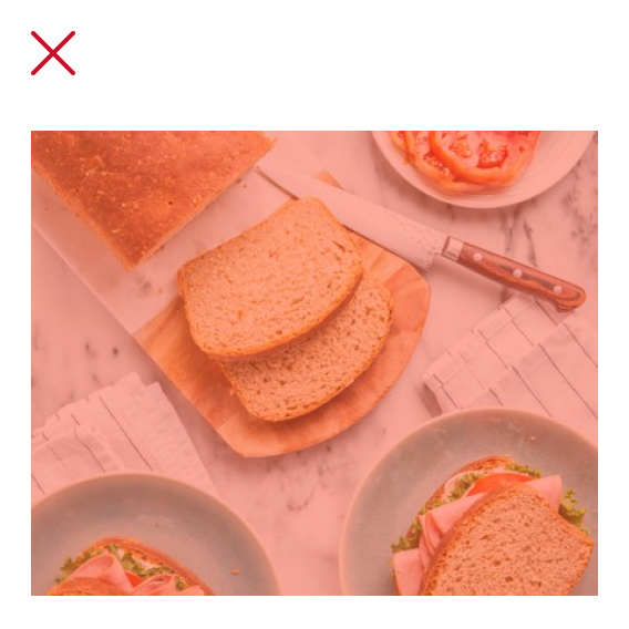
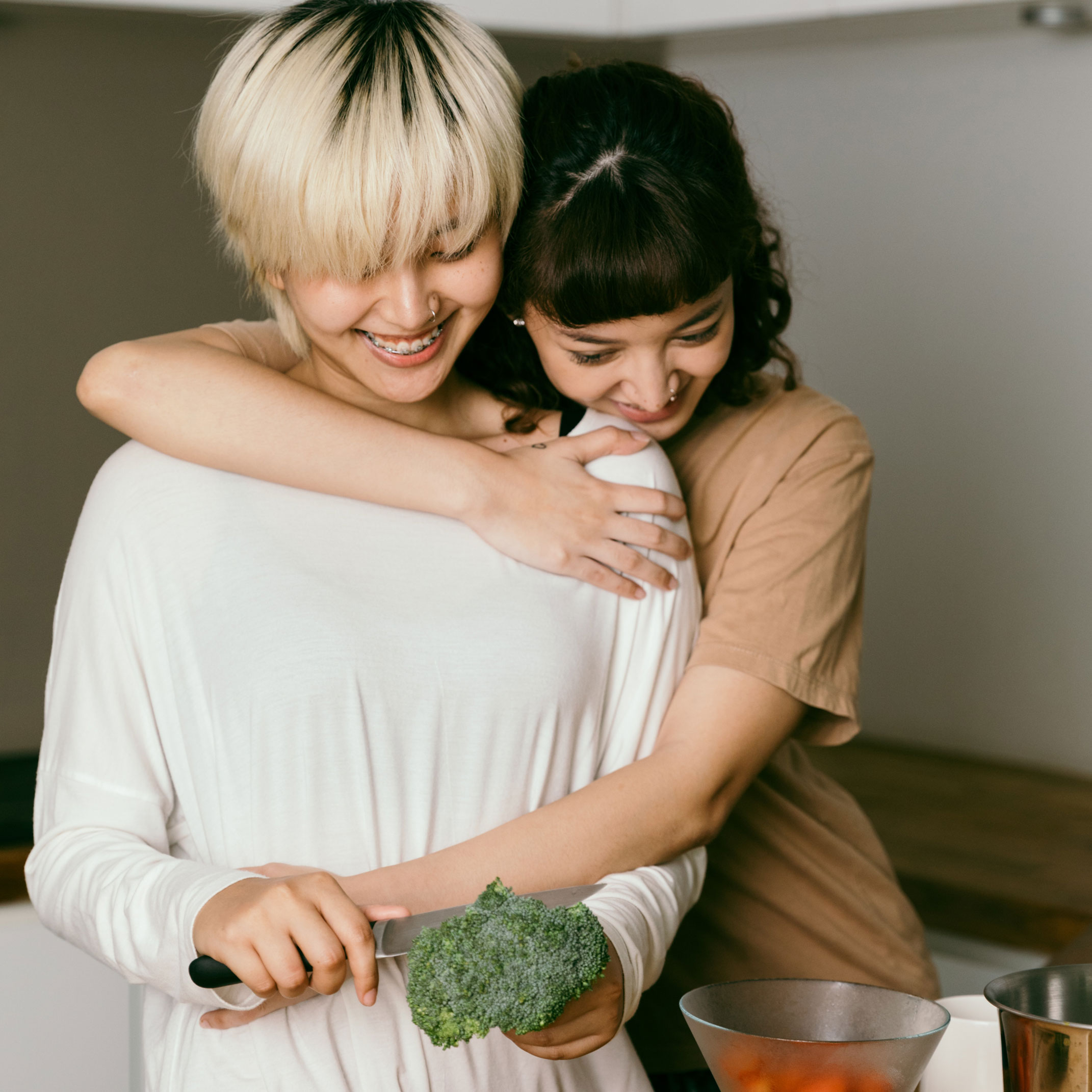
Photography
The goal of June's photography is to convey a sense of joy and delight. Clarification on how June works, or the technical aspects of June is unnecessary. The goal of the photography is to capture how it feels to live with June and how June makes our life better.
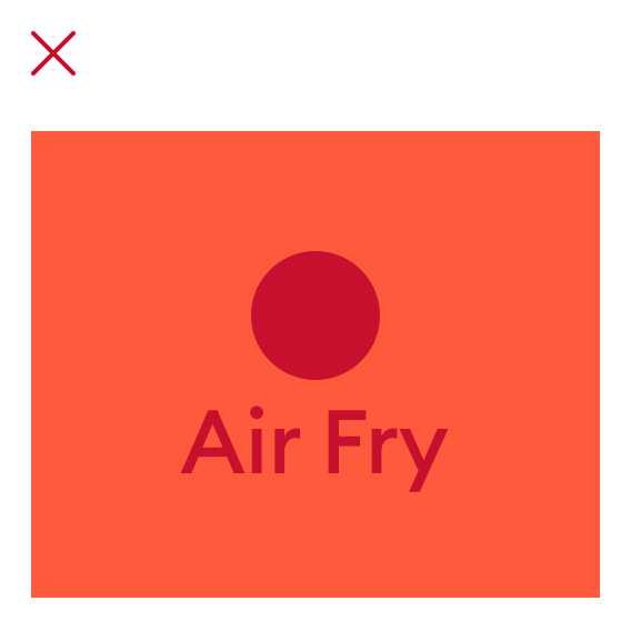
June Product Photography
The goal of photographing June is to showcase taste appeal—to visually communicate the delicious food June can make. Therefore, June should be photographed with food whenever possible. If food cannot be shown, June should be turned on with the heating elements on. Only when absolutely necessary, or conditions do not allow, should June be shown empty and turned off.
Human Interaction
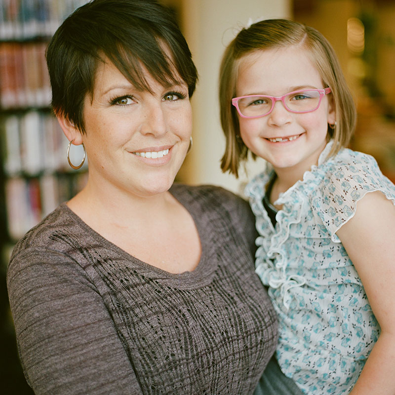
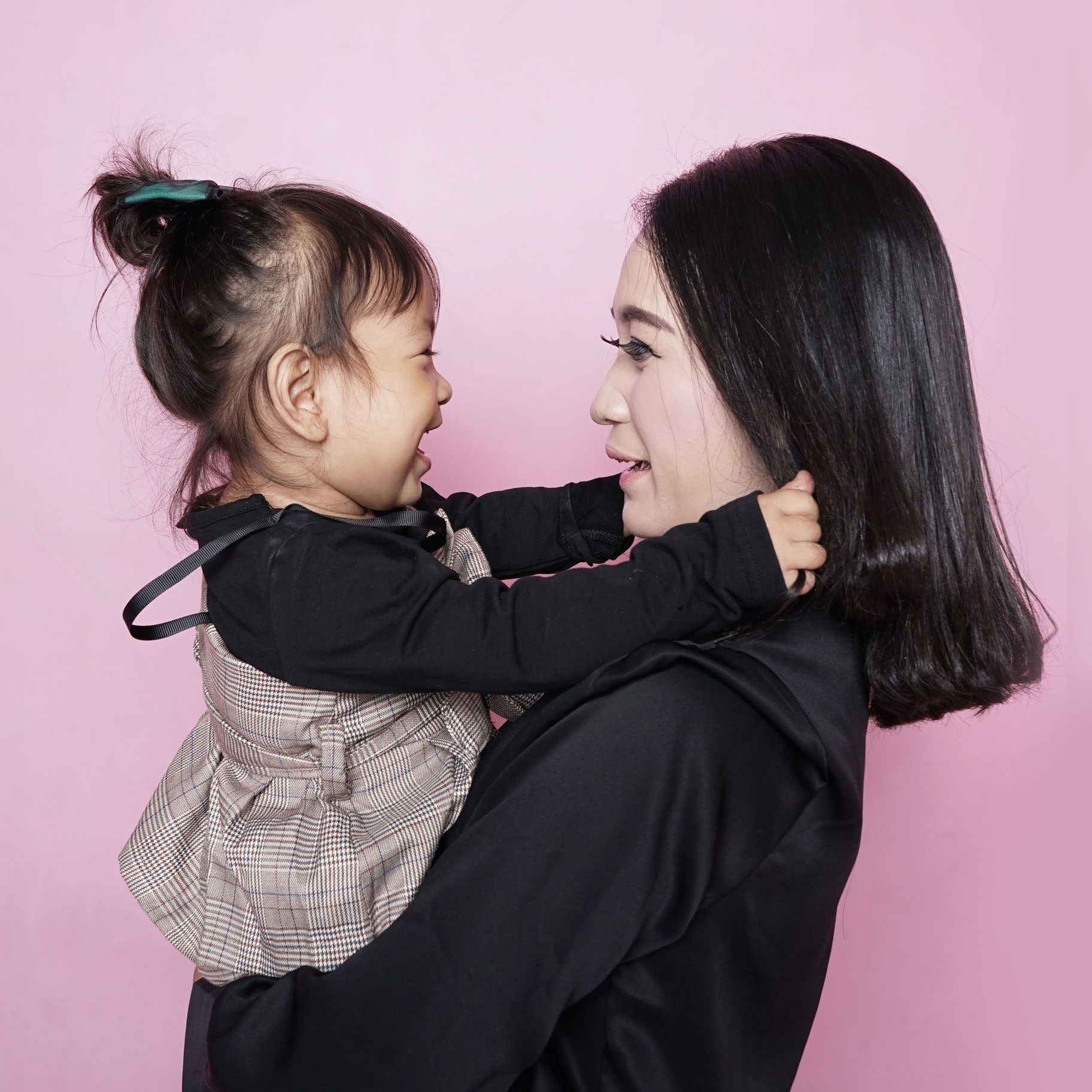
When photographing human interaction, either with each other or with June, interactions should feel authentic and relatable.
- Subjects are in lively moments, full of energy and positive emotional impact.
- Subjects should feel "caught in the moment" and unaware of the camera.
- Avoid photography that feels fake, over-posed or like stock photography.
- Use settings as more than backdrops. People should be living in their environment, interacting with the things and people around them.
- Use of motion is a great way to create authenticity and liveliness.
Casting
The primary demographic for June is young professionals, commonly with younger children. Talent should reflect this demo—they should easily fit the young professional (maybe parent) archetype.
When casting talent, shoot for a wide range of people (race, gender, sexual orientation, body type) that reflect June's broad audience.
Casting children is welcomed, but not necessary. In instances where children are not cast, bringing in family-style visuals (such as a kids' drawing on the refrigerator, or a wedding ring) should be utilized in a refined manner.
While the examples below don't necessarily reflect ideal location, composition or lighting, they are good examples of the types of people that we should aim for—diverse, authentic, naturally joyous, and could easily fit the professional parent role.
- Subjects should not look like professional models.
- Subjects should have a casual, cool and confident demeanor, and are comfortable behind the camera.


Composition
June photography should feel clean and uncluttered. While we don't want to create overly idealized or over-polished scenes, we want to ensure that we're communicating a lifestyle that is charming, upbeat and refreshing—a lifestyle that feels easy, free, and joyous.
- Take advantage of negative space to move the eye toward the main focus.
- Include negative space around the main subject for placement of additional design elements, such as typography.
- When possible, utilize the "rule of thirds" to improve overall composition
- Coordinate locations, backgrounds, and wardrobe to establish visual simplicity
- Simplify the scene rather than use shallow depths of field.
Lighting & Color
In order to convey a sense of joy, photography should feel light and natural.
- Lighting should appear very natural.
- No harsh highlights or shadows, particularly on a subject's face or body.
- Image should have a high dynamic range. Highlights and shadows should not be blown out and image should hold an edge if placed on white.
- Images should be properly white balanced.
- Images should not be over processed or feel "photoshopped."
- Images should never be low-key, feel heavy, over dramatic, or carry a sense of negativity.
- Wardrobe and location support natural light situations, and provide an easy-to-attain lighting environment.
Locations
In order to emphasize a happy, joyous lifestyle, locations should be simple, uncluttered and clean.
- Select locations with cohesive design style. While the particular style is not important, the style should be well put together.
- Introducing a few authentic, quirky props (such as a cute clock or bowl) to make the environment feel homey is always welcomed.
- Locations should be flooded with natural light, or feel very naturally lit.
- Images should not include personal items such as family photos or personal belongings.
- Props should feel familiar and not too eccentric
- Avoid cluttered or visually busy elements that distract from June or the scene.
- Color can be a great visual component so long as the palette is simple and not cluttered.
Wardrobe
In order to not take away from the overall scene, wardrobe should be kept simple, utilizing a primarily neutral palette.
- Wardrobe should be simple and non fussy.
- Choose clothing that has clean lines and doesn't feel overly complicated for fussy.
- While some pops of color are okay, generally keep to a more subdued palette.
- Clothes should not be overly baggy, unless culturally appropriate.
- Choose clothing that is fairly conservative. While it's not important to cover people up, choose safer clothing when in doubt.
- Clothing may not have logos, or detailing that is highly connected to a particular brand.
Copy
June is an invitation and innovation to enjoy, and our brand voice is no different. Delight and charm merge with tech talk and kitchen confidence to create copy that speaks consumers’ language. We’re upbeat, encouraging and have an optimistic attitude that’s nothing short of delicious.
Tone of Voice
Other brands sound like factories. June feels like family. Our brand name is based in springtime, sunshine and good vibes, so our tone builds on this valuable asset. June’s copy reaches beyond simply touting our tech to give people the uplifting, positive feelings of June all year round.
Here’s a taste of what we’re talking about: June is hungry. It constantly craves new ways to make your life easier. More fun. More flavorful. More delicious. It waits for you to get home so you can play together and unwind after a long day. It’s the bumper sticker that says, “My Other Car Is an Oven.” It’s the life of every party. It makes you look good, makes you smile, and makes you breakfast, lunch and dinner. It takes its tech seriously and knows how to cook up a good time. It’s all good things, all in one. Everybody loves June because June makes life taste better.
June Copy Is...
- Playful
- Polished
- Attention-Grabbing
- Smart
- Delightful
June Copy Is Not...
- Silly, Mischievous or Immature
- Formal, Scientific or Scholarly
- Loud, Provocative or Sexy
- Intellectual, Mechanical or Overengineered
- Cute, Quiet or Expected
Headlines
When it comes to headlines, June keeps things interesting. Sometimes they come from the personal perspective of June (ex: Your kitchen and I are officially an item.), and sometimes it’s the voice of our brand (ex: Never send a stovetop to do a June’s job.). No matter what though, our headlines should always feel like they’re spoken by a friend.
- Headlines should be conversational, but not unfiltered. We don’t curse, we don’t get overly technical, and we use proper grammar. After all, we’re a smart kitchen. We should sound sharp, educated and on-the-ball.
- Headlines should be confident, but not cocky. June knows it can rock your kitchen’s world, but it doesn’t act like a jerk about it. We never put down other brands or draw unnecessary comparison in headlines. That kind of negativity isn’t June’s style.
- Headlines should be fun and fresh, but not juvenile. We are an innovative, tech-forward company, so we have a youthful and refreshing tone of voice. But we aren’t teenagers or meme-writers. Copy should feel modern and relevant without feeling childish or like we’re trying too hard to be hip.
Samples
Sample 1
Yes: If easy does it, June does it too.
No: Make cooking perfectly easy.
Why?: The no example is expected and unimaginative. The yes example uses a play on words to infuse charm into the copy. It communicates ease versus simply saying the words.
Sample 2
Yes: Bumming you out is not one of my features.
No: Perfection you can trust.
Why?: The no example is clear, but uninspired and forgettable. The yes example is casual, cool and sounds like June is right there on your level. We’re not above consumers and we’re not below them. We are their companions and friends, thereto make their lives better (and make them smile, of course).
Sample 3
Yes: If easy does it, June does it too.
No: Make cooking perfectly easy.
Why?: The no example is expected and unimaginative. The yes example uses a play on words to infuse charm into the copy. It communicates ease versus simply saying the words.
Guidance
- June is gender-neutral. Never refer to June with the feminine pronoun “she.” Always use “I” (first-person from June’s perspective), or “June” or “it” (third-person from brand perspective).
- Never abbreviate or alter the June brand or product name.
- Do not refer to June as a “smart oven” as this is a trademark owned by Breville®.
- Avoid exclamation points. We want to be viewed as a trustworthy, cool and confident brand, not one that would yell at you. Leave that for the car dealerships. If a copy line is actually something you would shout (ex: Happy June, Everybody!), that’s fine. Just be smart and sparing with exclamations at all times.
- Punctuate properly, but avoid technical punctuation or over-punctuation. Our brand is best when our words do the talking without getting junked up by a bunch of unnecessary dots and squiggles. Also, avoid semicolons. Either split the statement into two sentences, or if you have a continuation of a thought, use an em dash (—).
- Balance personality-forward copy with product benefits as a way to promote our tech without getting too in-the-weeds with our language. (Ex: My tech never rests.WiFi connectivity means your features and functions are always up-to-date.)
- Avoid salesy, super technical or aggressive marketing speak.
- Keep sentences to a reasonable length. If it can be cut in half, cut it in half.
- Edit, edit, edit. Engaging content with June’s charm and personality is necessary, but fluff is not. We’re a brand that gets to the point, so don’t dilly dally with words. Say what you mean and do it in a way that only June would.
- Think big picture. June is a brand that brims with joy, energy and unstoppable cooking convenience. Consider where your copy is being used and what visual design will accompany it. This will help guide how much June personality is appropriate so we don’t go overkill.